はじめに
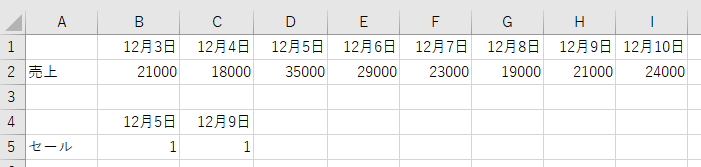
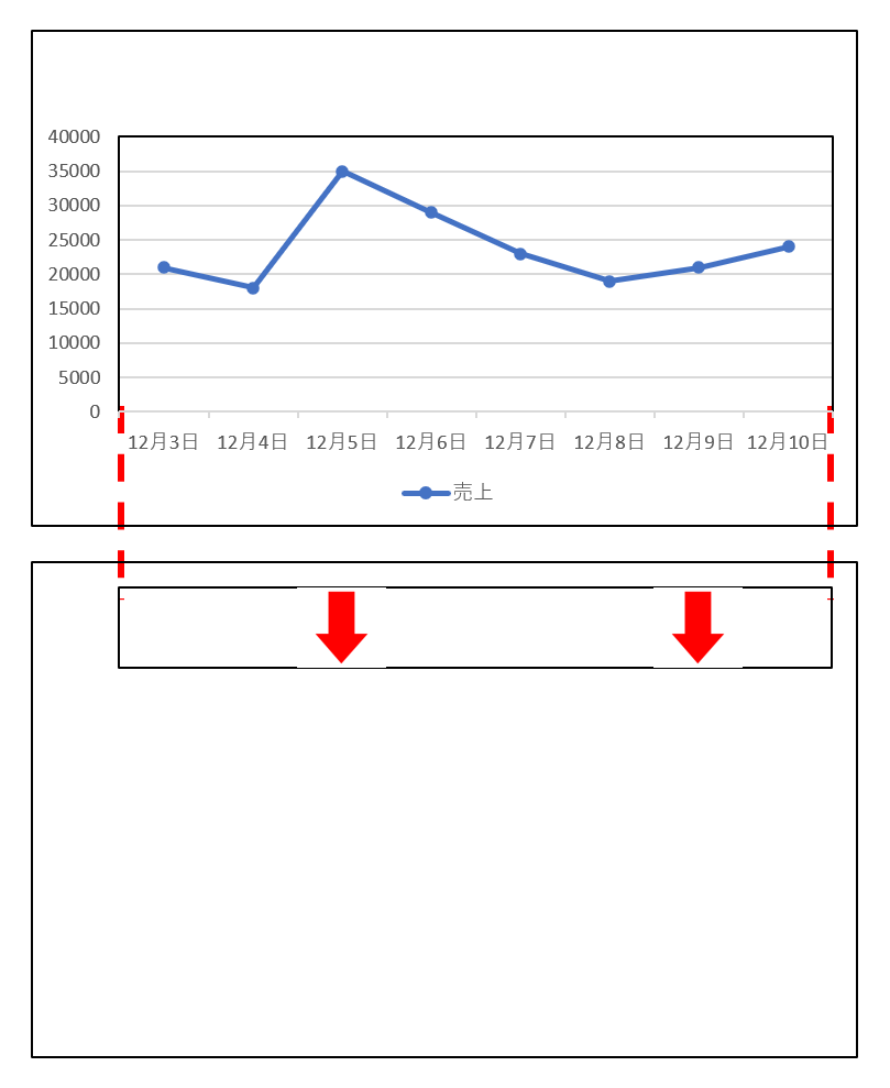
このようなエクセルシートから下のようなグラフを描きたいときがあります。セールを行うと売り上げにどう影響するかを確認するためです。セールを行った日の値を「1」としています。

ポイントは矢印の横位置が折れ線グラフのマーカーの位置に一致していることです。
二つのグラフを重ねることでできる【折れ線グラフを棒グラフの後ろにもってくる方法】や【第三軸を追加する方法】を以前紹介しました。
同じテクニックで今回は矢印を追加する方法を紹介します。
方法
次のような二つのグラフを描いてそれらを重ね合わせて完成です。
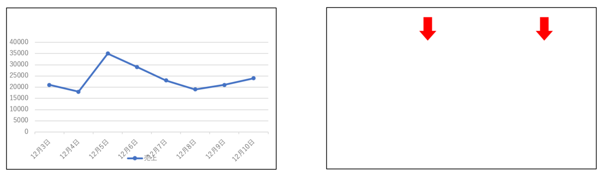
右のグラフは一見グラフに見えませんが棒グラフを変形したものです。
冒頭に示したエクセルシートがすでに用意されているとしましょう。
あとは以下のVBAコード(マクロ)を実行するだけです。
(注:作業中のワークブックを一度も保存していなければ一番最初でエラーがでます。一度保存してから再実行して下さい。)
ChDrive ThisWorkbook.Path
ChDir ThisWorkbook.Path

Dim i As Integer
i = Cells(Rows.Count, 1).End(xlUp).Row

Range(Cells(i + 2, 1), Cells(i + 2, 3)) = Array(50, 50, 50)
Range(Cells(i + 3, 1), Cells(i + 3, 3)) = Array(0, 40, 0)
Range(Cells(i + 4, 1), Cells(i + 4, 3)) = Array(0, 80, 0)
Range(Cells(i + 5, 1), Cells(i + 5, 3)) = Array(50, 0, 50)

Dim uriage As Range
Set uriage = Range("A1").CurrentRegion

Dim sale As Range
Set sale = Cells(i, 1).CurrentRegion

Dim my_data As Range
Set my_data = Cells(i + 2, 1).CurrentRegion

ActiveSheet.Shapes.AddChart2(276, xlArea).Select
ActiveChart.SetSourceData Source:=my_data

With ActiveChart
    .PlotBy = xlRows
    .ChartTitle.Delete
    .HasLegend = msoFalse

    .Axes(xlValue).MaximumScale = 120
    .Axes(xlValue).Delete

    .Axes(xlValue).MajorGridlines.Delete

    .Axes(xlCategory).Delete

    .FullSeriesCollection(1).ChartType = xlArea
    .FullSeriesCollection(2).ChartType = xlColumnStacked
    .FullSeriesCollection(3).ChartType = xlColumnStacked
    .FullSeriesCollection(4).ChartType = xlArea

    .ChartGroups(2).GapWidth = 0

    .PlotArea.Format.Fill.Visible = msoTrue
    .PlotArea.Format.Fill.ForeColor.RGB = RGB(255, 255, 255)

    .FullSeriesCollection(4).Format.Fill.Visible = msoTrue
    .FullSeriesCollection(4).Format.Fill.ForeColor.RGB = RGB(255, 255, 255)

    .FullSeriesCollection(2).Format.Fill.Visible = msoFalse

    .FullSeriesCollection(1).Format.Fill.Visible = msoTrue
    .FullSeriesCollection(1).Format.Fill.ForeColor.RGB = RGB(255, 0, 0)

    .FullSeriesCollection(3).Format.Fill.Visible = msoTrue
    .FullSeriesCollection(3).Format.Fill.ForeColor.RGB = RGB(255, 0, 0)

    .ChartArea.Width = 180
    .ChartArea.Format.Line.Visible = msoFalse

End With

ActiveChart.Export ("temp.png")

ActiveChart.Parent.Delete

ActiveSheet.Shapes.AddChart2(201, xlColumnClustered).Select
ActiveChart.SetSourceData Source:=sale

With ActiveChart

    .Parent.Name = "event_chart"

    .ChartTitle.Delete
    .HasLegend = msoFalse

    .Axes(xlValue).MaximumScale = 1
    .Axes(xlValue).Delete
    .Axes(xlValue).MajorGridlines.Delete

    .ChartGroups(1).GapWidth = 0

    .FullSeriesCollection(1).Format.Fill.UserPicture "temp.png"
End With

ActiveSheet.Shapes.AddChart2(332, xlLineMarkers).Select
ActiveChart.SetSourceData Source:=uriage

With ActiveChart
    .Parent.Name = "uriage_chart"

    .ChartTitle.Delete
    .HasLegend = msoTrue
    .Legend.Position = xlLegendPositionBottom

    .ChartArea.Format.Fill.Visible = msoFalse
    .ChartArea.Format.Line.Visible = msoFalse
End With

Dim min_scale As Variant
Dim max_scale As Variant

With ActiveSheet.ChartObjects("uriage_chart").Chart.Axes(xlCategory)
    min_scale = .MinimumScale
    max_scale = .MaximumScale
End With

With ActiveSheet.ChartObjects("event_chart").Chart.Axes(xlCategory)
    .MinimumScale = min_scale
    .MaximumScale = max_scale
    .Delete
End With

Dim event_w As Integer
Dim event_h As Integer
Dim event_l As Integer
Dim event_t As Integer

Dim uriage_w As Integer
Dim uriage_h As Integer
Dim uriage_l As Integer
Dim uriage_t As Integer

ActiveSheet.ChartObjects("event_chart").Chart.PlotArea.InsideHeight = 35

With ActiveSheet.ChartObjects("event_chart").Chart.PlotArea
    event_h = CInt(.Height)
End With

With ActiveSheet.ChartObjects("uriage_chart").Chart.PlotArea
    uriage_w = CInt(.InsideWidth)
    uriage_h = CInt(.InsideHeight)
    uriage_l = CInt(.InsideLeft)
    uriage_t = CInt(.InsideTop)
End With

ActiveSheet.ChartObjects("uriage_chart").Chart.PlotArea.InsideHeight = uriage_h - event_h
ActiveSheet.ChartObjects("uriage_chart").Chart.PlotArea.InsideTop = uriage_t + event_h

ActiveSheet.ChartObjects("event_chart").Chart.PlotArea.InsideWidth = uriage_w
ActiveSheet.ChartObjects("uriage_chart").Chart.PlotArea.InsideLeft = uriage_w

ActiveSheet.ChartObjects("event_chart").Chart.PlotArea.InsideLeft = uriage_l
ActiveSheet.ChartObjects("uriage_chart").Chart.PlotArea.InsideLeft = uriage_l

ActiveSheet.ChartObjects("event_chart").Select
ActiveSheet.ChartObjects("uriage_chart").Select Replace:=msoFalse
Selection.Group

my_data.ClearContents

Dim FSO As Object
Set FSO = CreateObject("Scripting.FileSystemObject")
FSO.DeleteFile "temp.png"
Set FSO = Nothing

Range("A1").Select
コードの解説
今回は棒グラフを矢印に変換する必要があります。
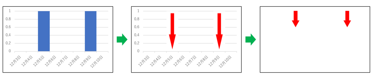
そのためには矢印の画像ファイルを用意する必要があります。
別途用意すれば良いのですがそれでは手間が増えるのでExcelで作るようにしました。
VBAコードの前半はそのコードです。
まずはワークシートの空いているスペースに数字を入力します。
Dim i As Integer
i = Cells(Rows.Count, 1).End(xlUp).Row

Range(Cells(i + 2, 1), Cells(i + 2, 3)) = Array(50, 50, 50)
Range(Cells(i + 3, 1), Cells(i + 3, 3)) = Array(0, 40, 0)
Range(Cells(i + 4, 1), Cells(i + 4, 3)) = Array(0, 80, 0)
Range(Cells(i + 5, 1), Cells(i + 5, 3)) = Array(50, 0, 50)
その数字を使って「積み上げ縦棒グラフ」と「面グラフ」を組み合わせて矢印を作ります。
Dim my_data As Range
Set my_data = Cells(i + 2, 1).CurrentRegion

ActiveSheet.Shapes.AddChart2(276, xlArea).Select
ActiveChart.SetSourceData Source:=my_data

With ActiveChart
    .PlotBy = xlRows
    .ChartTitle.Delete
    .HasLegend = msoFalse

    .Axes(xlValue).MaximumScale = 120
    .Axes(xlValue).Delete

    .Axes(xlValue).MajorGridlines.Delete

    .Axes(xlCategory).Delete

    .FullSeriesCollection(1).ChartType = xlArea
    .FullSeriesCollection(2).ChartType = xlColumnStacked
    .FullSeriesCollection(3).ChartType = xlColumnStacked
    .FullSeriesCollection(4).ChartType = xlArea

    .ChartGroups(2).GapWidth = 0

    .PlotArea.Format.Fill.Visible = msoTrue
    .PlotArea.Format.Fill.ForeColor.RGB = RGB(255, 255, 255)

    .FullSeriesCollection(4).Format.Fill.Visible = msoTrue
    .FullSeriesCollection(4).Format.Fill.ForeColor.RGB = RGB(255, 255, 255)

    .FullSeriesCollection(2).Format.Fill.Visible = msoFalse

    .FullSeriesCollection(1).Format.Fill.Visible = msoTrue
    .FullSeriesCollection(1).Format.Fill.ForeColor.RGB = RGB(255, 0, 0)

    .FullSeriesCollection(3).Format.Fill.Visible = msoTrue
    .FullSeriesCollection(3).Format.Fill.ForeColor.RGB = RGB(255, 0, 0)

    .ChartArea.Width = 180
    .ChartArea.Format.Line.Visible = msoFalse

End With
このような図(正確にはグラフ)が書けます。

一旦それを保存します。
ActiveChart.Export ("temp.png")
保存された矢印画像ファイルを棒グラフに適用します。
With ActiveChart
    .FullSeriesCollection(1).Format.Fill.UserPicture "temp.png"
End With
矢印を作るために使用したテーブルと保存した画像ファイルはゴミとなるので消去します。
my_data.ClearContents

Dim FSO As Object
Set FSO = CreateObject("Scripting.FileSystemObject")
FSO.DeleteFile "temp.png"
Set FSO = Nothing
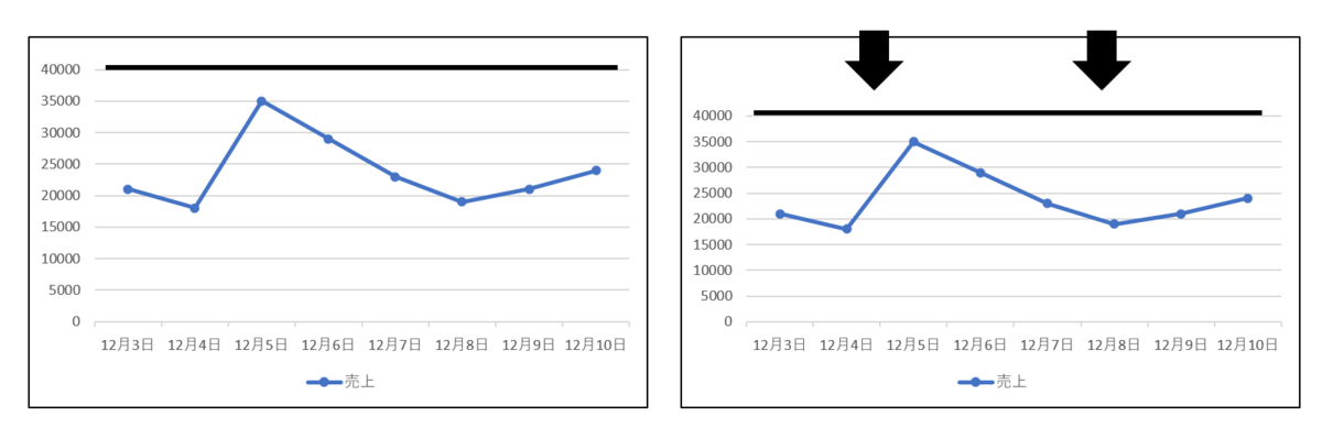
二つのグラフが描けたら次にプロットエリアの調整を行います。(実際にコード内で調整するのはプロットエリア内側です)
折れ線グラフのプロットエリアを矢印が入るスペース分下に縮めます。
ActiveSheet.ChartObjects("uriage_chart").Chart.PlotArea.InsideHeight = uriage_h - event_h
ActiveSheet.ChartObjects("uriage_chart").Chart.PlotArea.InsideTop = uriage_t + event_h
下に縮める場合には先にプロットエリアの高さを低く変更しておく必要があります。それをしないで上端を下にずらして縮めると下端がチャートエリアを超えることになるためうまくいきません。
次に二つのグラフのプロットエリアの横位置と幅を揃えます。
ActiveSheet.ChartObjects("event_chart").Chart.PlotArea.InsideWidth = uriage_w
ActiveSheet.ChartObjects("uriage_chart").Chart.PlotArea.InsideLeft = uriage_w

ActiveSheet.ChartObjects("event_chart").Chart.PlotArea.InsideLeft = uriage_l
ActiveSheet.ChartObjects("uriage_chart").Chart.PlotArea.InsideLeft = uriage_l
ここまで来たら後はグループ化して終了です。
ActiveSheet.ChartObjects("event_chart").Select
ActiveSheet.ChartObjects("uriage_chart").Select Replace:=msoFalse
Selection.Group
二つのグラフの位置は最初から重なっているはずなので調整は不要です。
動作環境
以下の環境で作成しています。
Windows 10
Office Home and Business 2019
![]()