はじめに
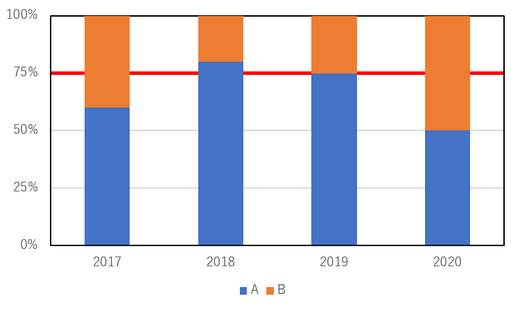
以前このようなグラフを書く必要がありました。

このグラフのポイントは50%を示す赤ラインが棒グラフの後ろを通っていることです。Excelではメモリ線(グリッドライン)の一本だけを赤色に変えることはできません。そうすると次に考えられる方法は赤ラインを折れ線グラフで描くことです。しかし折れ線グラフで描こうとするとどうしても棒グラフより折れ線グラフの方が前面に出てしまいます。
それを変更する簡単な方法が今でもわかりません。
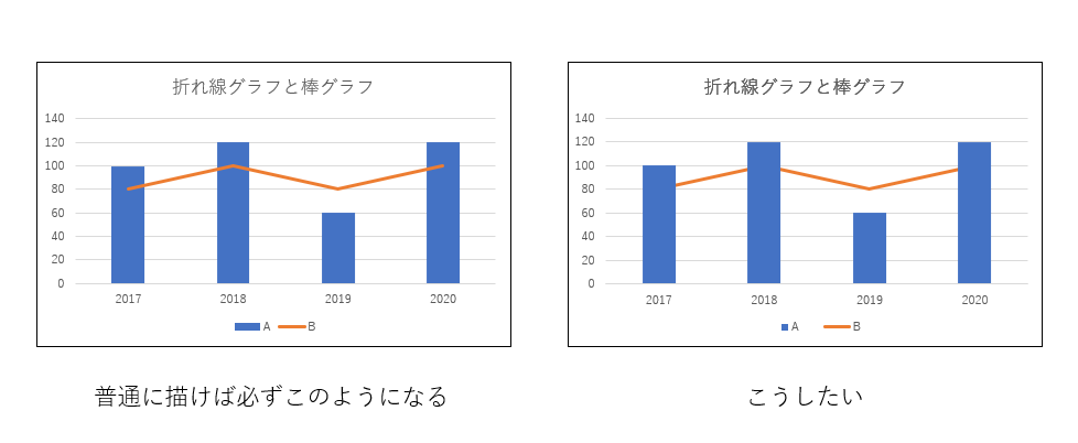
「それはExcelの仕様だからどうしようもない」と教えらえたこともあります。簡単には無理なのかもしれません。
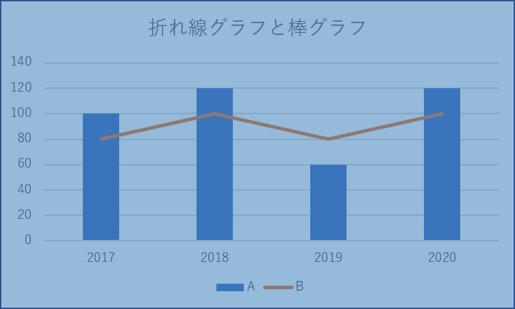
そのため以前は「R」を使ってグラスを作成しました。
touch-sp.hatenablog.com
何としてもExcelだけで問題を解決したい。そこで二つのグラフを作成して重ねることにしました。
そこでも問題が発生します。プロットエリアの内側をどうしても二つのグラフで統一させる必要があります。そのためにはVBAを使用するしか方法はなさそうです。
チャートエリアとプロットエリアについて
Excelグラフには3つのエリアがあります。
二つのグラフを重ねるにはプロットエリア内側の位置と大きさを統一する必要があります。先ほども書きましたがプロットエリア内側を数値で指定するにはVBAを使うしか方法はありません。
詳細については後述のコードを見てもらえればわかると思います。
では実際にやってみましょう
| 2017 | 2018 | 2019 | 2020 | |
|---|---|---|---|---|
| A | 60 | 80 | 75 | 50 |
| B | 40 | 20 | 25 | 50 |
(例として75%に赤ラインを引きました)
方法
まずは1行追加して表を拡張して下さい。
また、表の左上がExcelシートの「A1」に来るようにして下さい。
| 2017 | 2018 | 2019 | 2020 | |
|---|---|---|---|---|
| A | 60 | 80 | 75 | 50 |
| B | 40 | 20 | 25 | 50 |
| C | 0.75 | 0.75 | 0.75 | 0.75 |
Dim my_data2 As Range
Set my_data2 = Range("A1:E1,A4:E4")

ActiveSheet.Shapes.AddChart2(227, xlLine).Select
ActiveChart.SetSourceData Source:=my_data2

With ActiveChart
    .Parent.Name = "chart2"

    .ChartTitle.Delete

    .FullSeriesCollection(1).Format.Line.ForeColor.RGB = RGB(255, 0, 0)

    .Axes(xlValue).MinimumScale = 0
    .Axes(xlValue).MaximumScale = 1
    .Axes(xlValue).MajorUnit = 0.25
    .Axes(xlValue).Delete

    .Axes(xlCategory).AxisBetweenCategories = False
    .Axes(xlCategory).Delete

    .ChartArea.Format.Line.Visible = msoFalse
End With

Dim my_data As Range
Set my_data = Range("A1:E3")

ActiveSheet.Shapes.AddChart2(297, xlColumnStacked100).Select
ActiveChart.SetSourceData Source:=my_data

With ActiveChart
    .Parent.Name = "chart1"

    .ChartTitle.Delete
    .HasLegend = True
    .Legend.Position = xlLegendPositionBottom

    .Axes(xlValue).MinimumScale = 0
    .Axes(xlValue).MaximumScale = 1
    .Axes(xlValue).MajorUnit = 0.25
    .Axes(xlValue).TickLabels.NumberFormatLocal = "0%"

    .Axes(xlValue).MajorGridlines.Format.Line.Visible = msoFalse

    .Axes(xlCategory).Format.Line.Visible = msoTrue
    .Axes(xlCategory).Format.Line.ForeColor.RGB = RGB(0, 0, 0)

    .ChartArea.Format.Fill.Visible = msoFalse
    .ChartArea.Format.Line.Visible = msoFalse

    .PlotArea.Format.Line.Visible = msoCTrue
    .PlotArea.Format.Line.ForeColor.RGB = RGB(0, 0, 0)

End With

Dim w As Integer
Dim h As Integer
Dim l As Integer
Dim t As Integer

ActiveSheet.ChartObjects("chart1").Select

w = CInt(ActiveChart.PlotArea.InsideWidth)
h = CInt(ActiveChart.PlotArea.InsideHeight)
l = CInt(ActiveChart.PlotArea.InsideLeft)
t = CInt(ActiveChart.PlotArea.InsideTop)

ActiveChart.PlotArea.InsideWidth = w
ActiveChart.PlotArea.InsideHeight = h
ActiveChart.PlotArea.InsideLeft = l
ActiveChart.PlotArea.InsideTop = t

ActiveSheet.ChartObjects("chart2").Select

ActiveChart.PlotArea.InsideWidth = w
ActiveChart.PlotArea.InsideHeight = h
ActiveChart.PlotArea.InsideLeft = l
ActiveChart.PlotArea.InsideTop = t

ActiveSheet.ChartObjects("chart1").Select Replace:=msoFalse
Selection.Group
コードの説明
コードは3部構成になっています。
- 下に来るグラフを作成する
- 上に来るグラフを作成する
- 二つのグラフのプロットエリア内側を統一させる
一つ一つ見ていきましょう。
Dim my_data2 As Range
Set my_data2 = Range("A1:E1,A4:E4")

ActiveSheet.Shapes.AddChart2(227, xlLine).Select
ActiveChart.SetSourceData Source:=my_data2
これによって以下のグラフが作成されます。
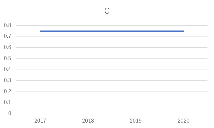
これをひとつひとつ変更していきます。
グラフに名前を付ける
With ActiveChart
    .Parent.Name = "chart2"
End With
グラフタイトルを消す
With ActiveChart
    .ChartTitle.Delete
End With
グラフのラインの色を赤色に変更する
With ActiveChart
    .FullSeriesCollection(1).Format.Line.ForeColor.RGB = RGB(255, 0, 0)
End With
縦軸の目盛を最小 0、最大 1, 間隔 0.25にして消す
With ActiveChart
    .Axes(xlValue).MinimumScale = 0
    .Axes(xlValue).MaximumScale = 1
    .Axes(xlValue).MajorUnit = 0.25
    .Axes(xlValue).Delete
End With
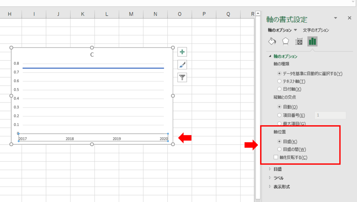
横軸の軸位置を「目盛」に変更して消す
With ActiveChart
    .Axes(xlCategory).AxisBetweenCategories = False
    .Axes(xlCategory).Delete
End With
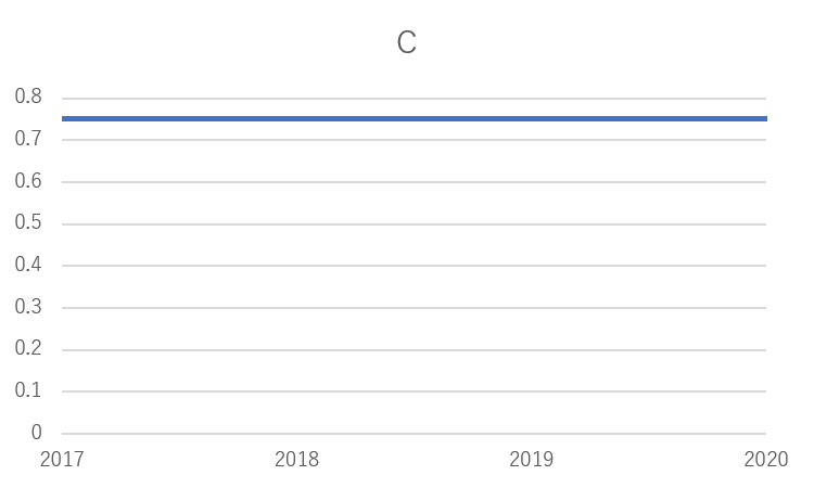
これによってグラフがこのように変わります。

グラフのチャートエリアの枠線を消す
With ActiveChart
    .ChartArea.Format.Line.Visible = msoFalse
End With
次に二つ目のグラフを描きます。
Dim my_data As Range
Set my_data = Range("A1:E3")

ActiveSheet.Shapes.AddChart2(297, xlColumnStacked100).Select
ActiveChart.SetSourceData Source:=my_data
これによって以下のグラフが作成されます。

これをひとつひとつ変更していきます。
一つ目と重複する説明は省略します。
凡例をグラフの下に表示する
With ActiveChart
    .HasLegend = True
    .Legend.Position = xlLegendPositionBottom
End With
縦軸の目盛をパーセント表示に変更する(最初からそうなっているのでこの行は不要)
With ActiveChart
    .Axes(xlValue).TickLabels.NumberFormatLocal = "0%"
End With
グリッドラインを消す
With ActiveChart
    .Axes(xlValue).MajorGridlines.Format.Line.Visible = msoFalse
End With
横軸の軸の色を黒色に変更する
With ActiveChart
    .Axes(xlCategory).Format.Line.Visible = msoTrue
    .Axes(xlCategory).Format.Line.ForeColor.RGB = RGB(0, 0, 0)
End With
チャートエリアの塗りつぶし、枠線を「なし」にする
With ActiveChart
    .ChartArea.Format.Fill.Visible = msoFalse
    .ChartArea.Format.Line.Visible = msoFalse
End With
プロットエリア内側の枠線の色を黒色に変更する
With ActiveChart
    .PlotArea.Format.Line.Visible = msoCTrue
    .PlotArea.Format.Line.ForeColor.RGB = RGB(0, 0, 0)
End With
最後に二つのグラフのプロットエリア内側を統一させてグループ化する
Dim w As Integer
Dim h As Integer
Dim l As Integer
Dim t As Integer

ActiveSheet.ChartObjects("chart1").Select

w = CInt(ActiveChart.PlotArea.InsideWidth)
h = CInt(ActiveChart.PlotArea.InsideHeight)
l = CInt(ActiveChart.PlotArea.InsideLeft)
t = CInt(ActiveChart.PlotArea.InsideTop)

ActiveChart.PlotArea.InsideWidth = w
ActiveChart.PlotArea.InsideHeight = h
ActiveChart.PlotArea.InsideLeft = l
ActiveChart.PlotArea.InsideTop = t

ActiveSheet.ChartObjects("chart2").Select

ActiveChart.PlotArea.InsideWidth = w
ActiveChart.PlotArea.InsideHeight = h
ActiveChart.PlotArea.InsideLeft = l
ActiveChart.PlotArea.InsideTop = t

ActiveSheet.ChartObjects("chart1").Select Replace:=msoFalse
Selection.Group
二つ目のグラフのプロットエリア内側の位置、サイズを一つ目のグラフに設定しています。
(作成した順番と名前が一致していないので注意して下さい。一つ目のグラフが「chart2」、二つ目のグラフが「chart1」です。)
ここでポイントは一旦整数に変更していることです。
小数などの細かい数字で設定すると勝手に微調整されて全く同じにはならないことがありました。そのため整数に変更する必要がありました。
動作環境
以下の環境で作成しています。
Windows 10
Office Home and Business 2019
【2020年12月19日追記】
ほかにも同様のテクニックでできることを記事にしました。もしよかったら読んで下さい。
touch-sp.hatenablog.com
touch-sp.hatenablog.com
![]()